Documentation
Developer Documentation
Search site
Payment Widget
theme: minimalist
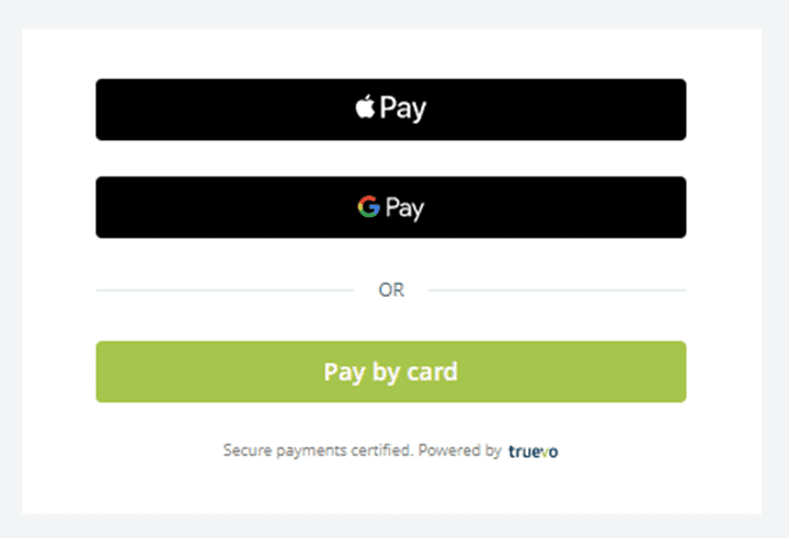
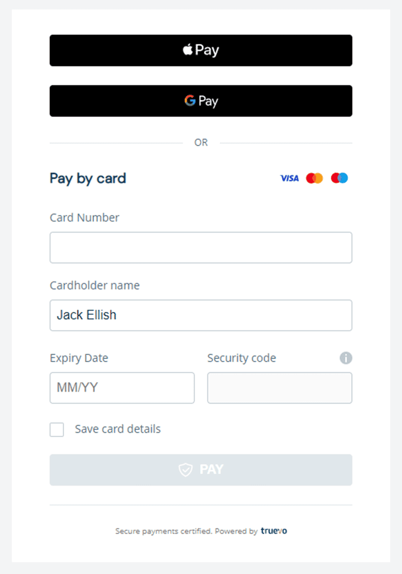
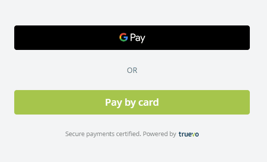
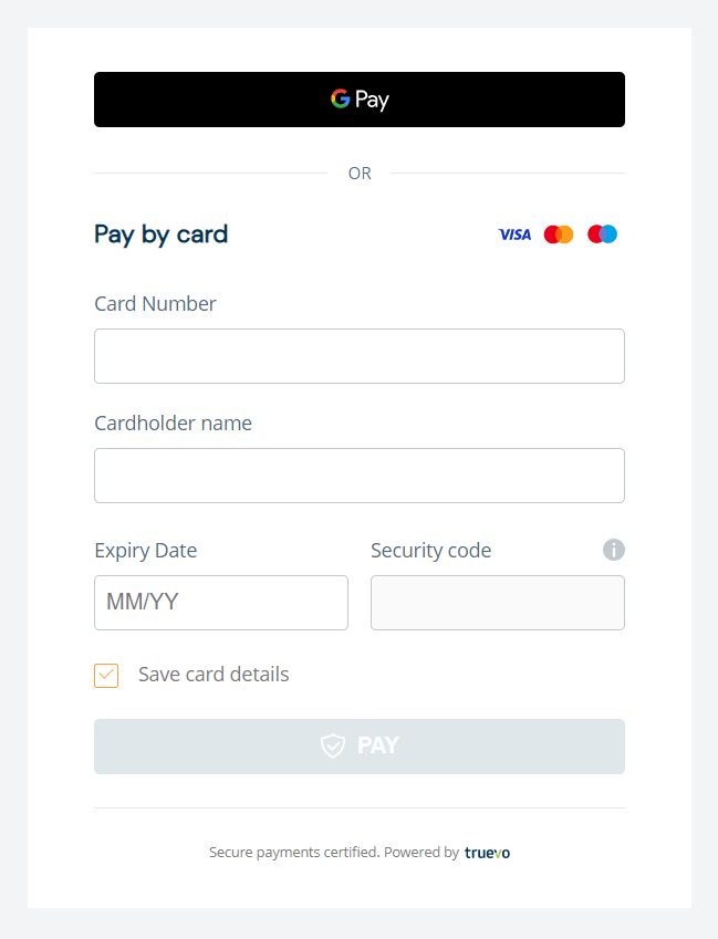
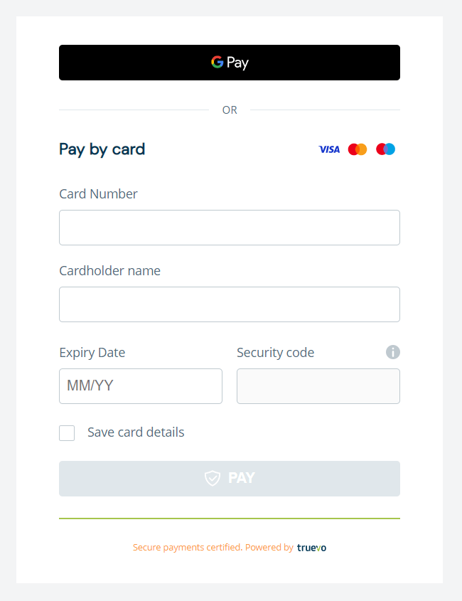
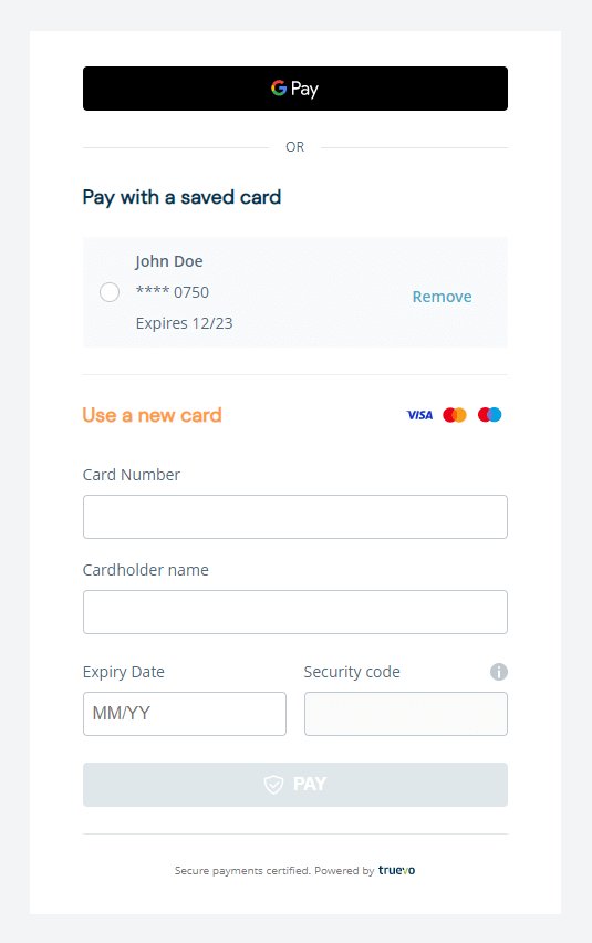
Payment Widget card without any saved cards.
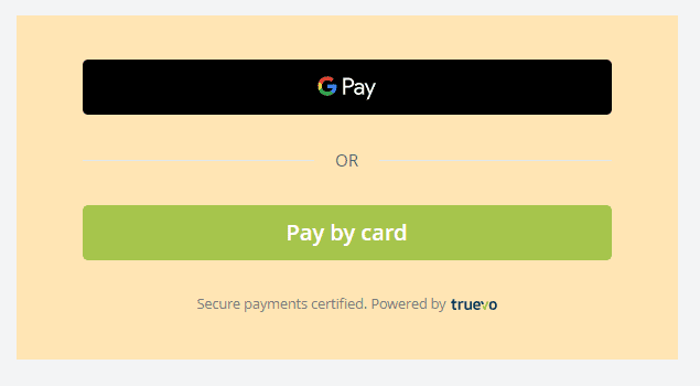
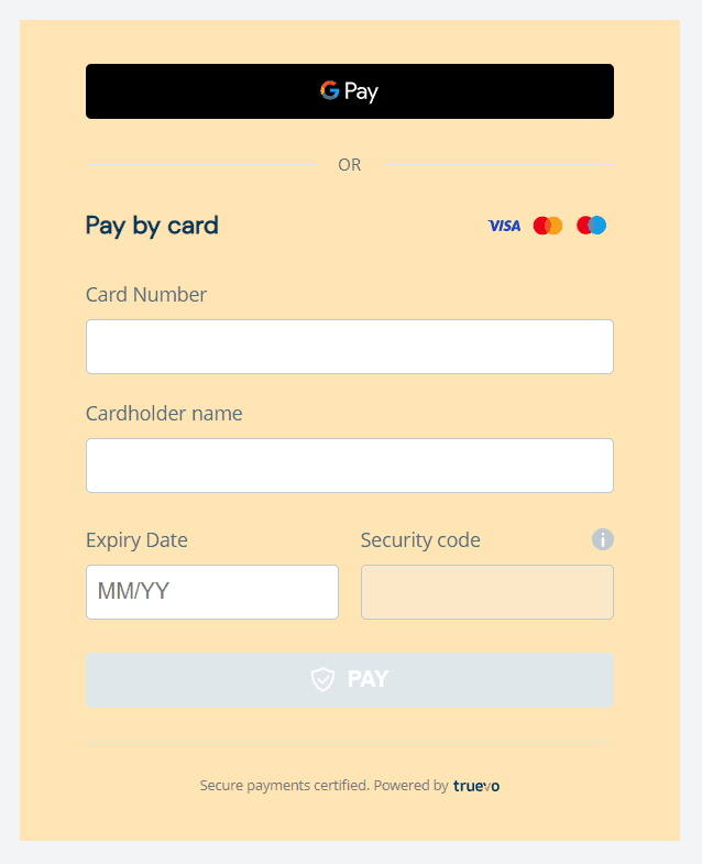
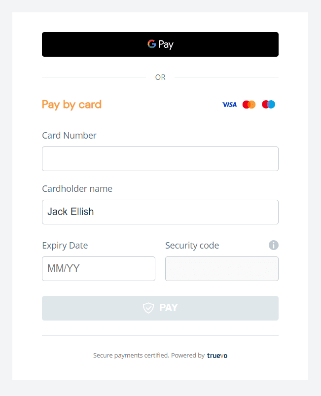
The Truevo form container’s background can be customised.
					#truevo_form_container,
.truevo-apple-pay-or-span,
.truevo-apple-pay-or-span::after,
.truevo-apple-pay-or-span::before,
.truevo-plus-button {
    background: transparent !important;
    background-color: transparent !important;
}
The widget background colour and shadow can be transparent.
					#truevo_form_container, .truevo-apple-pay-or-span {
  background: transparent !important;
  box-shadow: 0 4px 8px transparent !important;
}
					#truevo_form_container
  > .truevo-card-main-container
  > .truevo-new-card-container
  > .truevo-pay-by-card
  > .truevo-pay-by-card-txt {
  color: #fc9d44 !important;
  font-size: 18px !important;
}
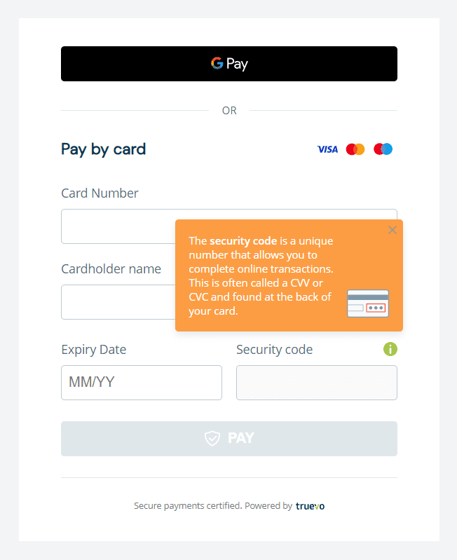
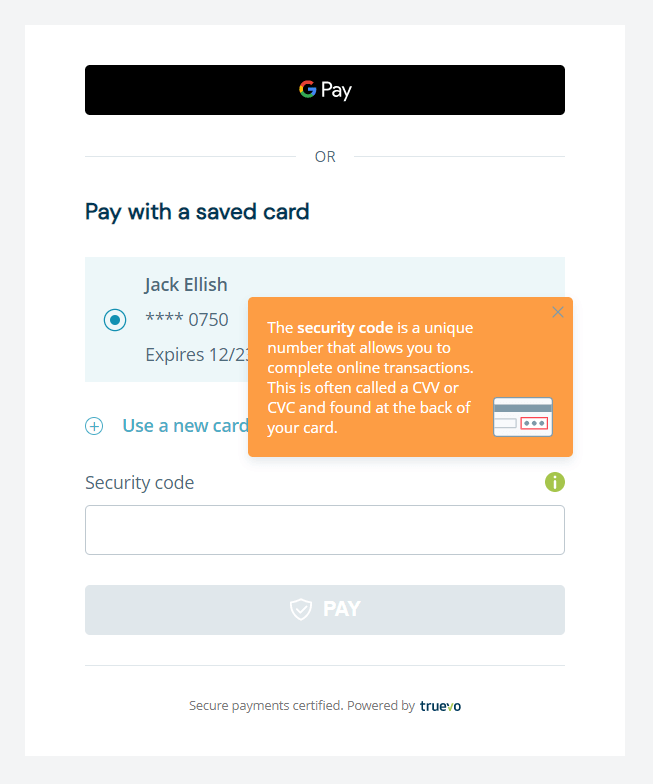
The tooltip background and text colour can be customised.
					.truevo-default-ip-label.truevo-security-label-div > .truevo-card-cvc-img-div > .cvv-info {
  background: #fc9d44 !important;
  color: #fff !important;
}
The “Save card details” checkbox can be customised.
					/* Change Checkbox label color */
#truevo_form_container
  > .truevo-card-main-container
  > .truevo-new-card-container
  > .truevo-buttons-div
  > .truevo-options-div
  > .truevo-each-option-div
  > label {
  color: #787878 !important;
}

/* To style checkbox */
#truevo_form_container
  > .truevo-card-main-container
  > .truevo-new-card-container
  > .truevo-buttons-div
  > .truevo-options-div
  > .truevo-each-option-div
  > label
  > span {
  border: 1px solid #fc9d44 !important;
}

#truevo_form_container
  > .truevo-card-main-container
  > .truevo-new-card-container
  > .truevo-buttons-div
  > .truevo-options-div
  > .truevo-each-option-div
  > label
  > input:checked
  ~ span {
  border: 1px solid #fc9d44 !important;
  background: #fff !important;
}

/* Style after it is checked */
#truevo_form_container
  > .truevo-card-main-container
  > .truevo-new-card-container
  > .truevo-buttons-div
  > .truevo-options-div
  > .truevo-each-option-div
  > label
  > input:checked
  ~ span:after {
  border: solid #fc9d44 !important;
  border-width: 1px 1px 0 0 !important;
}
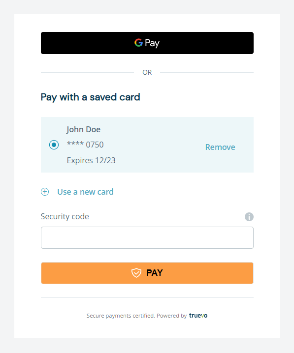
The “Pay” button can be customised when it’s in active state.
					.truevo-default-btn.truevo-pay-btn {
  background: #fc9d44 !important;
  color: #000 !important;
}
The text size and colour of the “OR” separator can be customised.
					.truevo-apple-pay-or-span::after {
    color: #fc9d44 !important;
}

.truevo-apple-pay-or-span::before {
    background-color: #fc9d44 !important;
}
The border line and text style of the footer can be customised.
					#truevo_form_container > .truevo-footer-div {
    border-top: 2px solid #a6c54c !important;
    color: #fc9d44 !important;
}
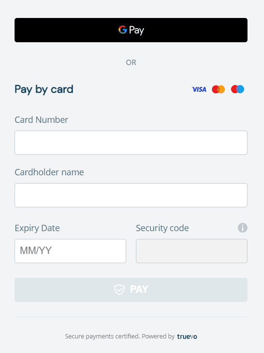
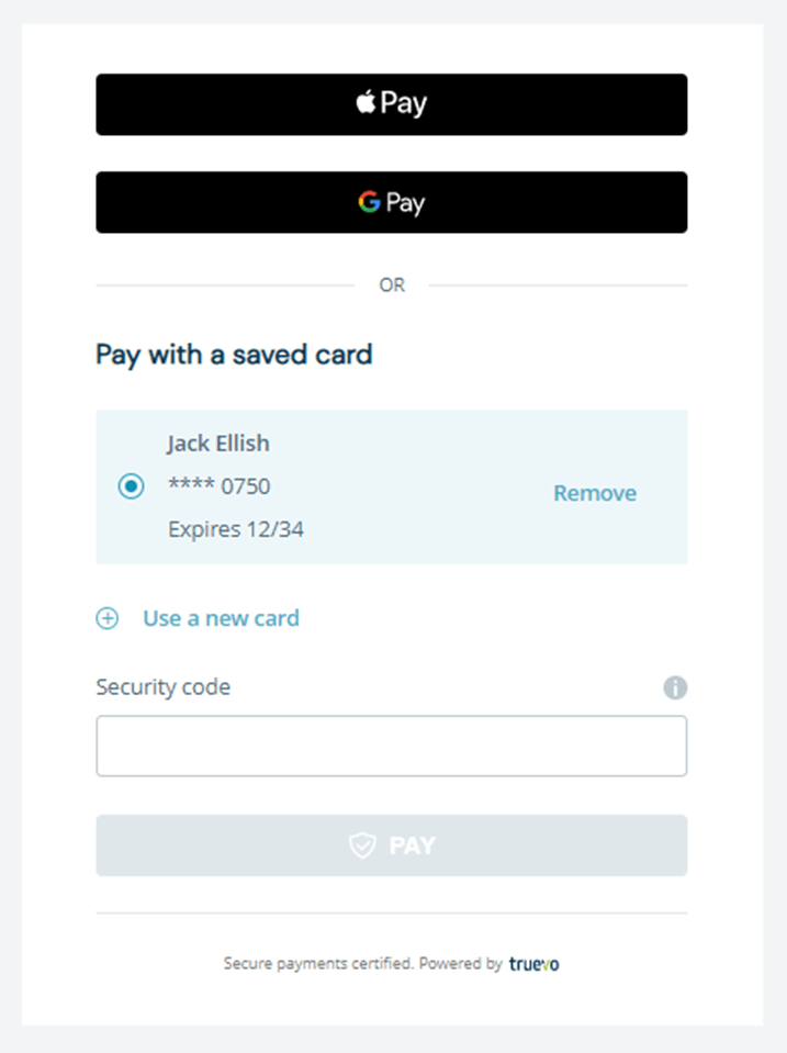
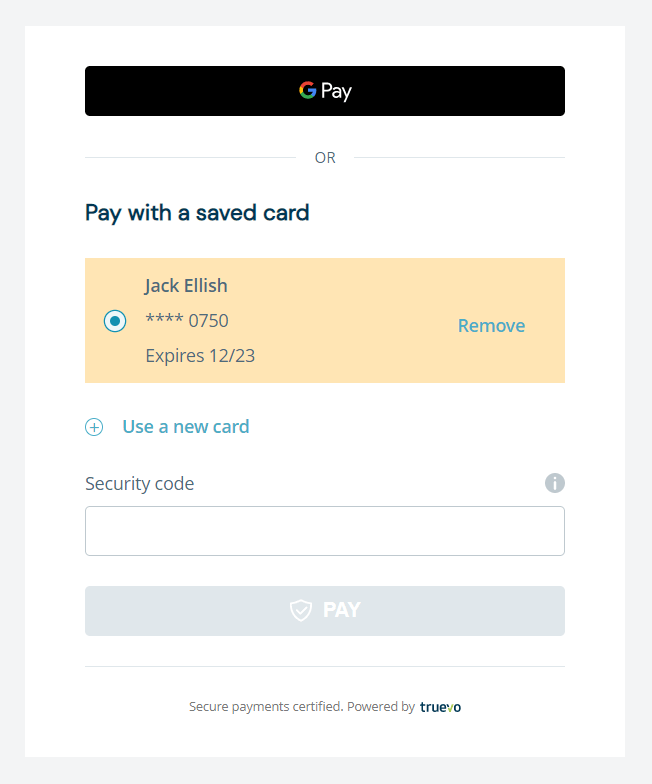
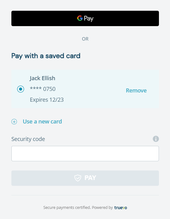
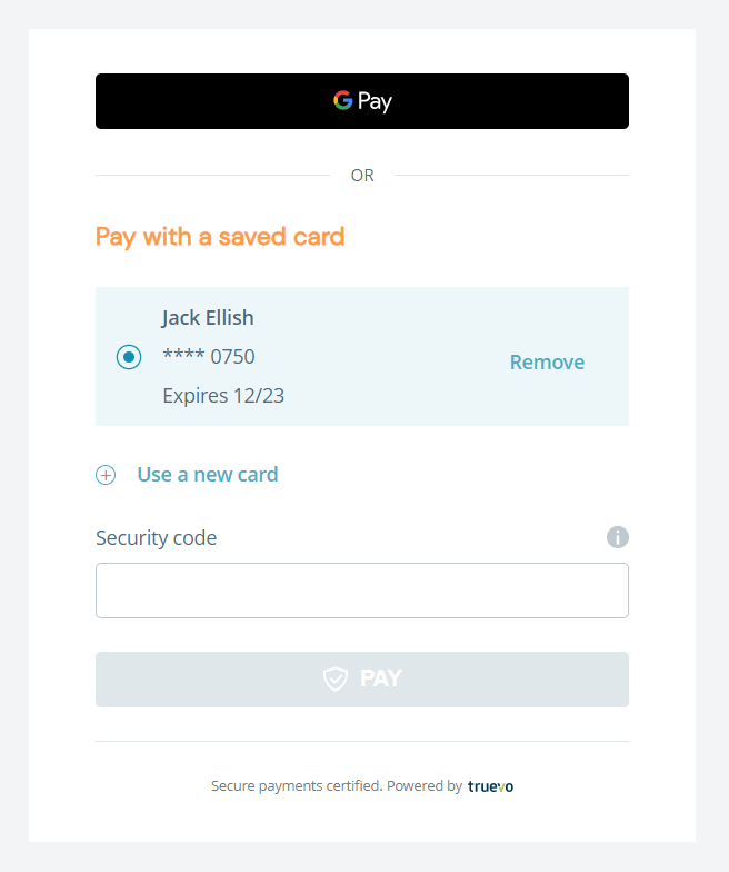
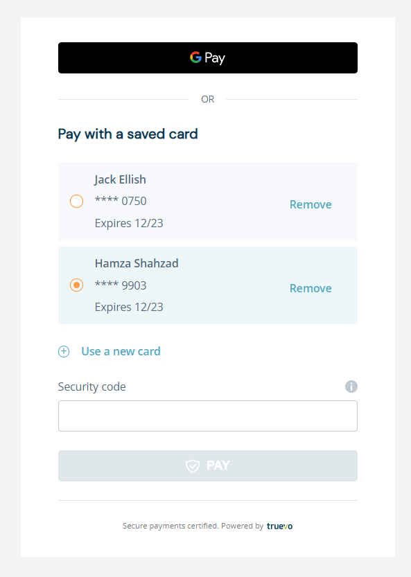
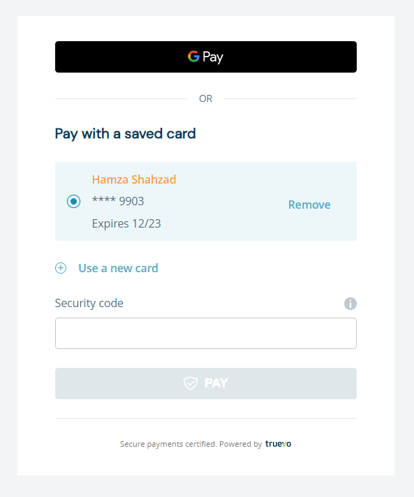
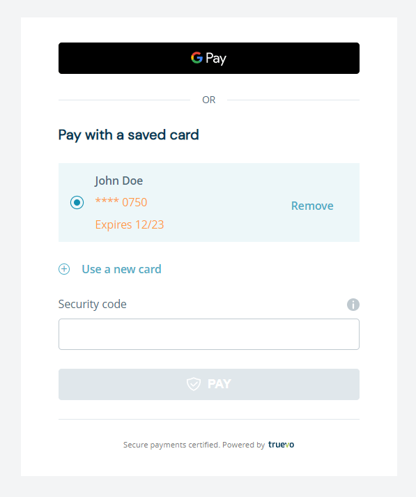
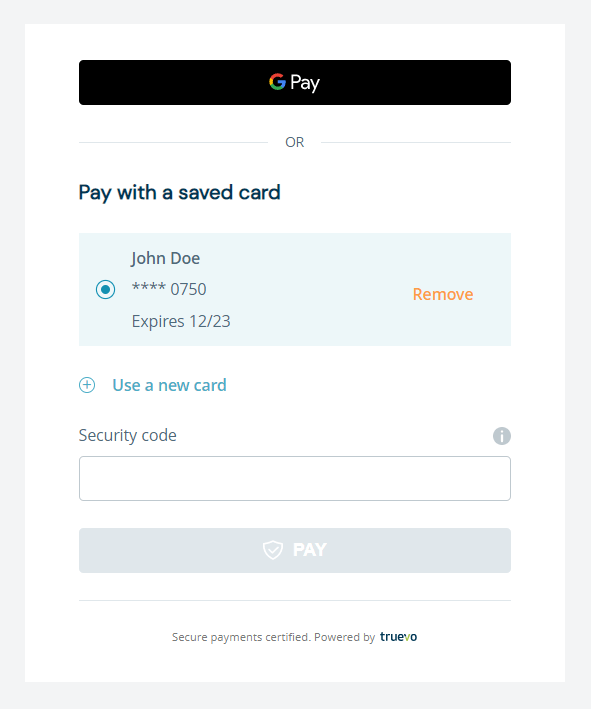
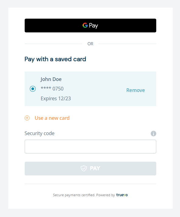
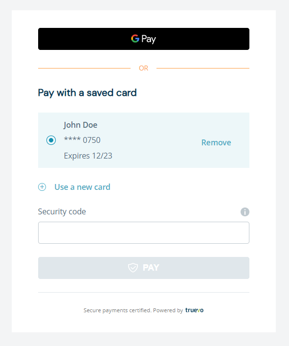
Payment Widget card with cards already saved.
					#truevo_form_container
  > .truevo-card-main-container
  > .truevo-saved-cards-container
  > .truevo-each-card {
  background: #ffe5b4 !important;
}
					#truevo_form_container
  > .truevo-card-main-container
  > .truevo-saved-cards-container
  > .truevo-saved-cards-title-div {
  color: #fc9d44 !important;
  font-size: 18px !important;
}
The saved card selector colour can be customised.
					/* Checked radio button */
#truevo_form_container
  > .truevo-card-main-container
  > .truevo-saved-cards-container
  > .truevo-each-card
  > .truevo-radio-button-div
  > .truevo-select-card[checked="true"] {
  box-shadow: 0 0 0 1px #fc9d44 !important;
  background: #fc9d44 !important;
}

/* Unchecked radio button */
span.truevo-default-radio.truevo-select-card {
  box-shadow: 0 0 0 1px #fc9d44 !important;
}
The cardholder name colour and text size can be changed.
					#truevo_form_container
  > .truevo-card-main-container
  > .truevo-saved-cards-container
  > .truevo-each-card
  > .truevo-card-details
  > .truevo-card-details-div
  > .truevo-card-name {
  color: #fc9d44 !important;
  font-size: 14px !important;
}
The card details colour and text size can be changed.
					#truevo_form_container
  > .truevo-card-main-container
  > .truevo-saved-cards-container
  > .truevo-each-card
  > .truevo-card-details
  > .truevo-card-details-div {
  color: #fc9d44 !important;
  font-size: 14px !important;
}
The saved card’s “Remove” button can be customised.
					#truevo_form_container
  > .truevo-card-main-container
  > .truevo-saved-cards-container
  > .truevo-each-card
  > .truevo-card-details
  > .truevo-each-card-button-div
  > button {
  color: #fc9d44 !important;
}
The “Use new card” button can be customised.
					/* To style button label */
#truevo_form_container
  > .truevo-card-main-container
  > .truevo-new-card-btn-div
  > label {
  color: #fc9d44 !important;
}

/* To style button icon */
.truevo-plus-button {
  border: 1px solid #fc9d44 !important;
  background: white !important;
}

.truevo-plus-button:before,
.truevo-plus-button:after {
  background: #fc9d44 !important;
}
					/* Text */
.truevo-apple-pay-or-span::after {
  color: #fc9d44 !important;
  font-size: 14px !important;
}

/* Border line */
.truevo-apple-pay-or-span::before {
  background-color: #fc9d44 !important;
}
The “Use a new card” heading and text size can be customised.
					#truevo_form_container>
.truevo-card-main-container>
.truevo-new-card-container>
.truevo-pay-by-card>
.truevo-pay-by-card-txt {
color: #fc9d44 !important;
font-size: 18px !important;
}
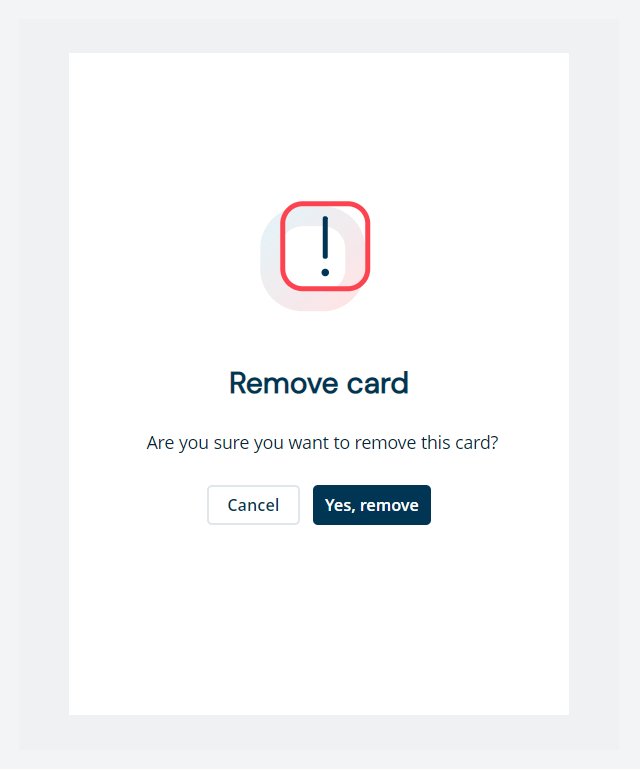
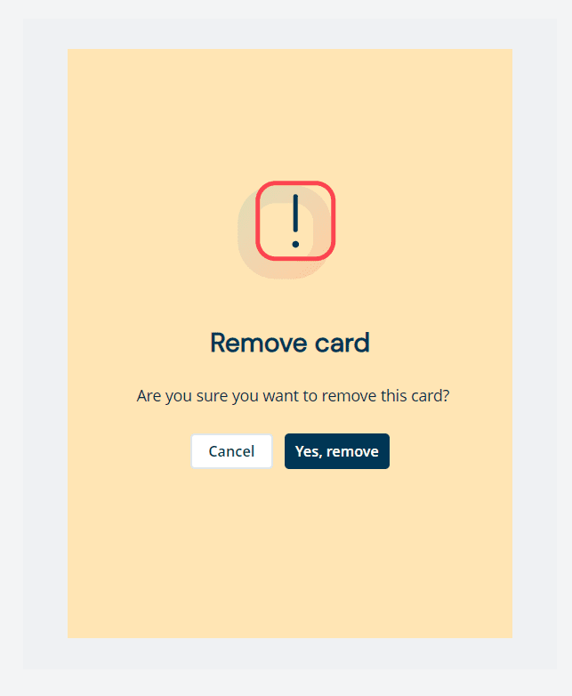
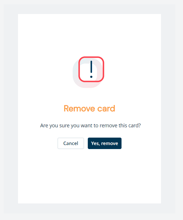
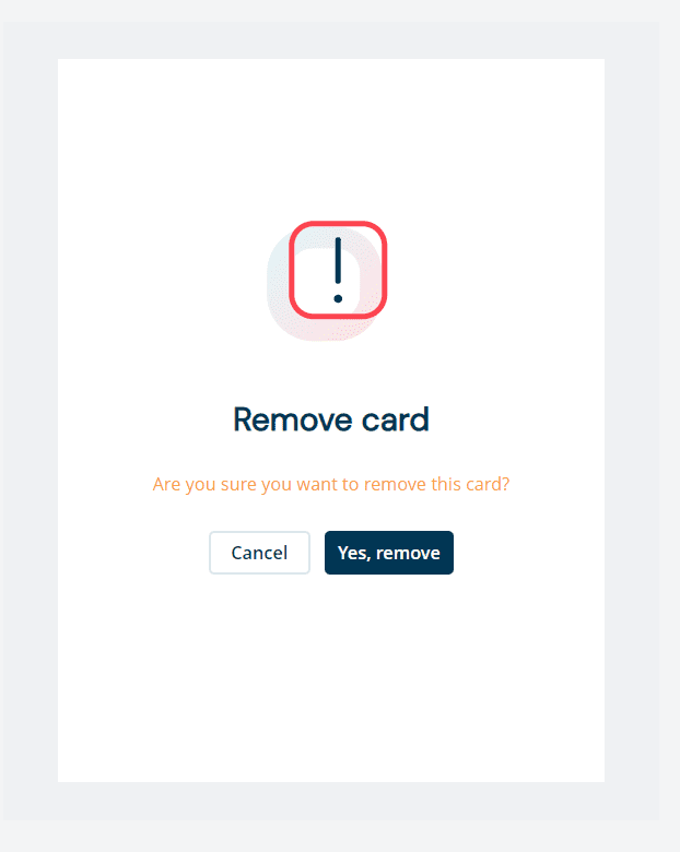
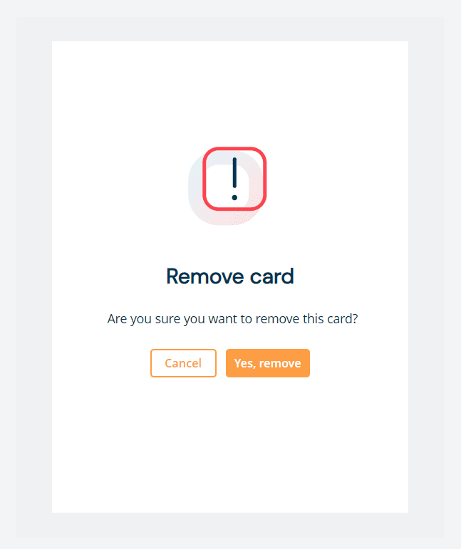
The “Remove card” confirmation message is displayed when a customer selects the “Remove” button.
The confirmation message background colour can be customised.
.truevo-modal-block { background: #ffe5b4 !important; }
The heading colour and size can be customised.
					.truevo-card-header {
  color: #fc9d44 !important;
  font-size: 18px !important;
}
The descriptor text colour and size can be customised.
					.truevo-info-text {
  color: #fc9d44 !important;
  font-size: 13px !important;
}
The button colours can be customised.
					/* card buttons color */

/* Confirm button */
.truevo-btn-modal-remove__popup {
  background: #fc9d44 !important;
  color: #fff !important;
}

/* Cancel button */
.truevo-btn-modal-cancel__popup {
  background: #fff !important;
  color: #fc9d44 !important;
  border-color: #fc9d44 !important;
}
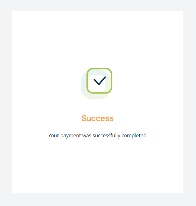
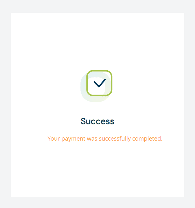
The heading colour of the “Success” or “Rejected” message can be customised.
					#truevo_form_container
  > .truevo-card-result-div
  > .truevo-card-result-div-title {
  color: #fc9d44 !important;
  font-size: 23px !important;
}
The descriptor text colour of the “Success” or “Rejected” message can be customised.
					#truevo_form_container
  > .truevo-card-result-div
  > .truevo-card-result-div-description {
  color: #fc9d44 !important;
  font-size: 16px !important;
}