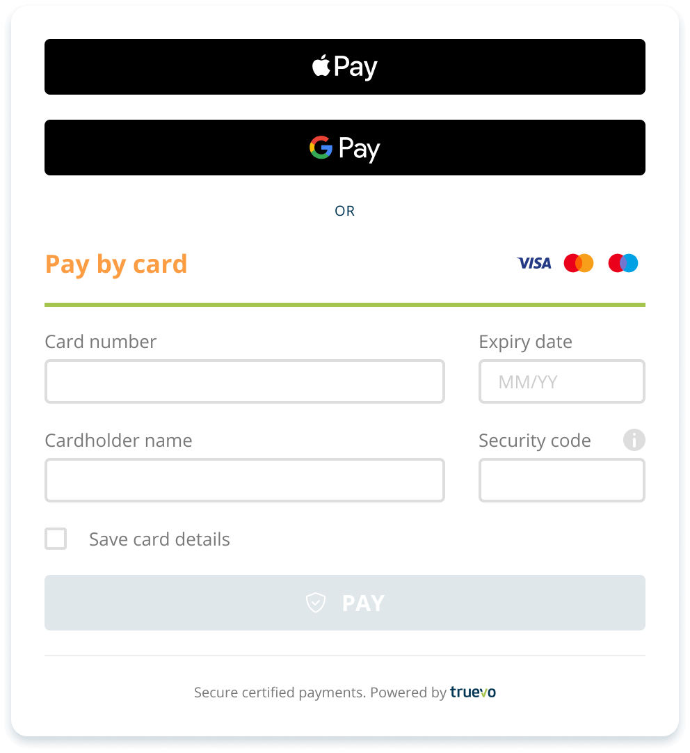
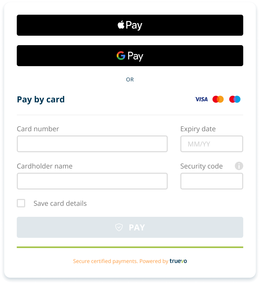
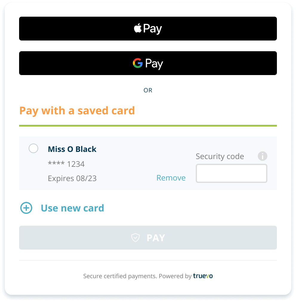
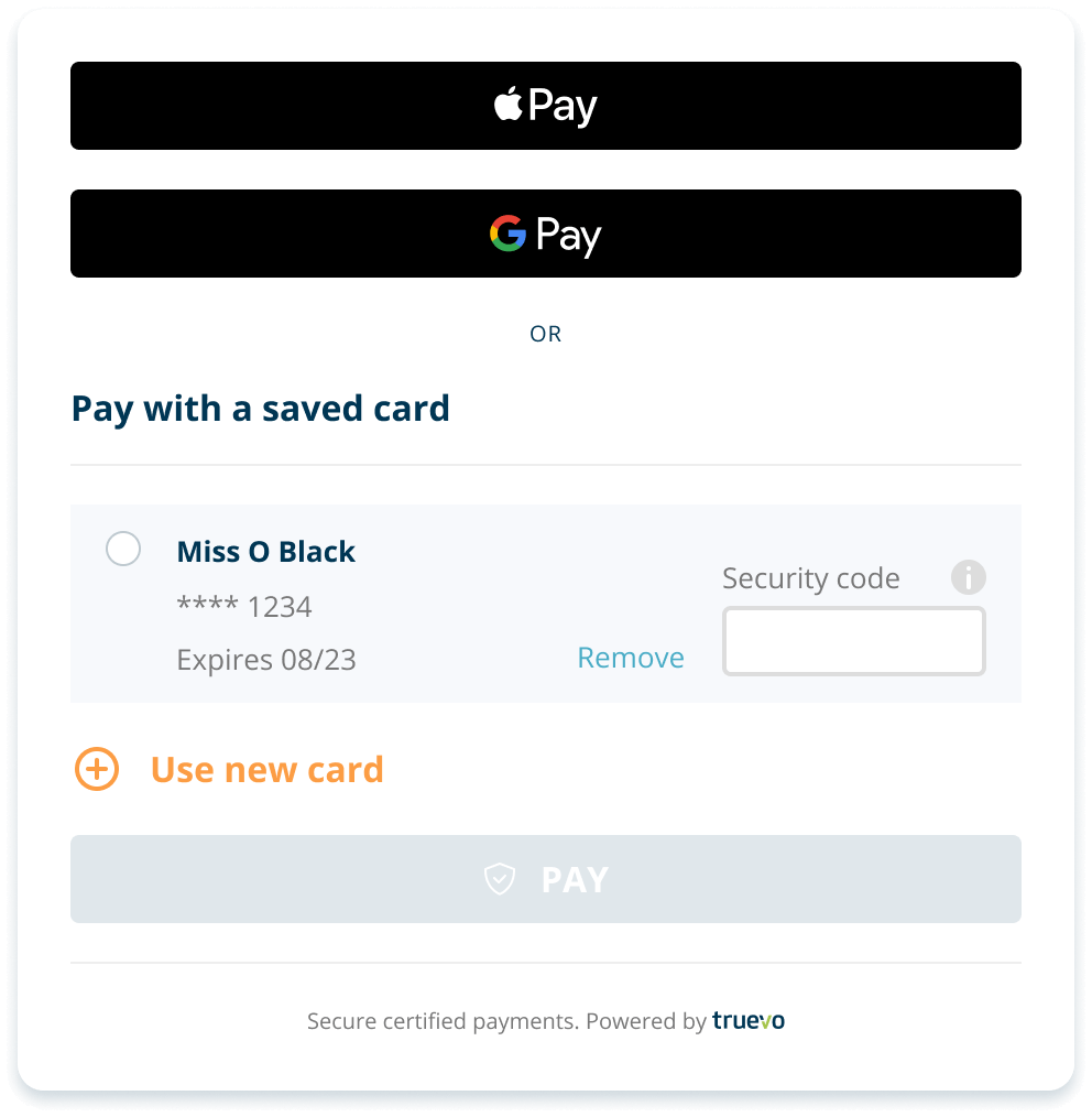
/* Heading text */
#truevo_form_container
> .truevo-card-main-container
> .truevo-new-card-container
> .truevo-pay-by-card
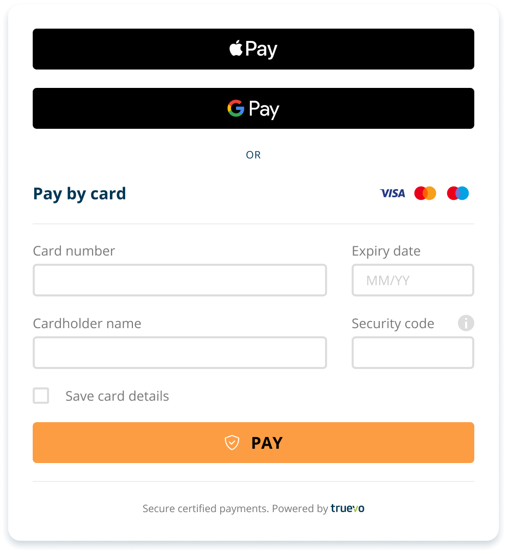
> .truevo-pay-by-card-txt {
color: #fc9d44 !important;
font-size: 18px !important;
}
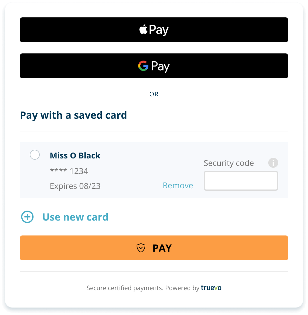
/* Border line */
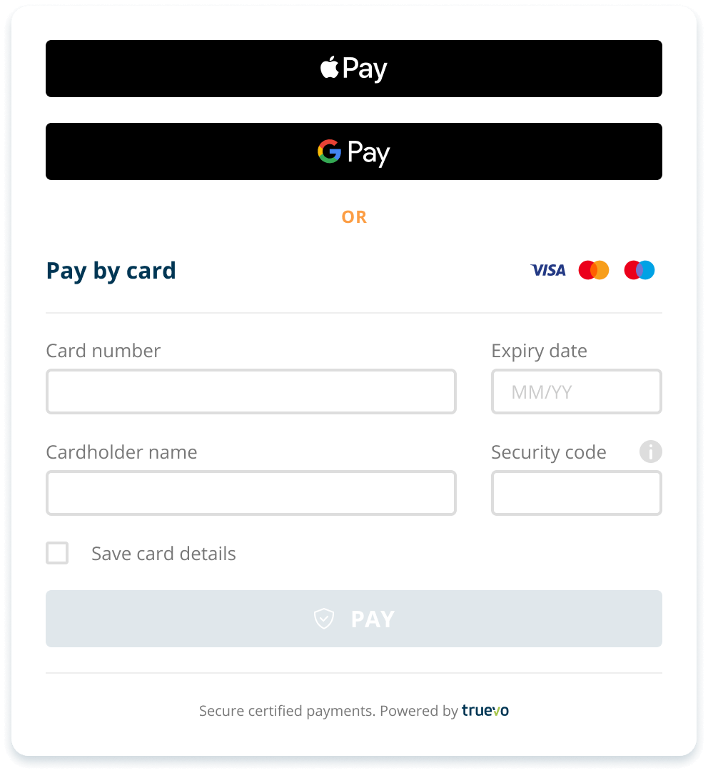
#truevo_form_container
> .truevo-card-main-container
> .truevo-new-card-container
> .truevo-pay-by-card {
border-bottom: 3px solid #a6c54c !important;
}

